
When you’re working with data, visualizing it can help you understand trends, patterns, and relationships between different variables. This is where Seaborn comes in. Seaborn is a popular Python library built on top of Matplotlib, designed to make it easier to create beautiful and informative statistical graphs. If you’ve ever heard of Matplotlib, Seaborn makes it even better by adding useful features and simplifying complex visualizations.
In this article, we’ll take a closer look at Seaborn, what it offers, and how you can use it to create various types of plots. We’ll also explore the differences between Seaborn and Matplotlib to help you understand when to use each library.
What is Seaborn?
Seaborn is a high-level data visualization library in Python. It helps you create stunning statistical graphics using just a few lines of code. Seaborn is especially useful when you are working with datasets and want to explore relationships between variables. The library comes with a variety of built-in themes and color palettes, which means your graphs will look polished and professional without needing much customization.
Why Use Seaborn?
Here are some reasons to use Seaborn:
- Simplified plotting: Seaborn makes it easier to create complex visualizations with minimal code.
- Works with Pandas: Seaborn is built to work with Pandas dataframes, so you can easily pass in columns to plot.
- Beautiful defaults: Seaborn comes with built-in themes and color schemes, making your graphs look great without extra effort.
- Great for statistics: Seaborn excels at creating statistical plots like regression plots, pair plots, and heatmaps.
Getting Started with Seaborn
Before we dive into using Seaborn, let’s first install it. If you don’t have it installed yet, run the following command in your terminal or command prompt:
pip install seaborn
Importing Seaborn
Once installed, you can start using Seaborn by importing it, along with Matplotlib for displaying the plots:
import seaborn as sns
import matplotlib.pyplot as plt
Basic Plotting with Seaborn
Seaborn simplifies the process of creating beautiful visualizations. Let’s start with a few basic plots.
Scatter Plot
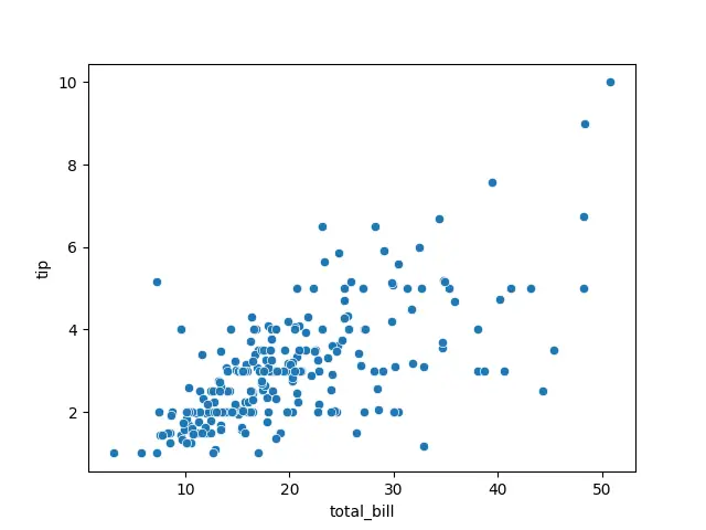
A scatter plot helps to visualize the relationship between two variables. Here’s how to create one using Seaborn:
# Importing required libraries
import seaborn as sns
import matplotlib.pyplot as plt

# Loading a sample dataset
tips = sns.load_dataset("tips")

# Creating a scatter plot
sns.scatterplot(x='total_bill', y='tip', data=tips)

# Display the plot
plt.show()
In this example, we’re plotting the ‘total_bill‘ against the ‘tip‘ amount from the built-in ‘tips‘ dataset.
Output
Bar Plot
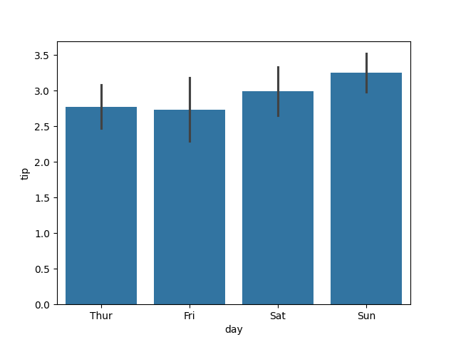
A bar plot shows comparisons between different categories. Seaborn makes it easy:
# Importing required libraries
import seaborn as sns
import matplotlib.pyplot as plt

# Loading a sample dataset
tips = sns.load_dataset("tips")

# Bar plot to show the average tip by day
sns.barplot(x='day', y='tip', data=tips)

# Display the plot
plt.show()
This plot will show you how the average tip changes based on the day of the week.
Output
Heatmap
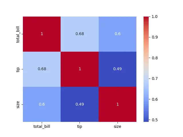
A heatmap is useful for showing correlations between variables or the strength of relationships. Here’s an example:
# Importing required libraries
import seaborn as sns
import matplotlib.pyplot as plt

# Loading a sample dataset
tips = sns.load_dataset("tips")

# Selecting only numeric columns
numeric_tips = tips.select_dtypes(include=['float64', 'int64'])

# Creating a heatmap to visualize correlations
sns.heatmap(numeric_tips.corr(), annot=True, cmap='coolwarm')

# Display the plot
plt.show()
The ‘heatmap‘ function will help you visualize the correlation between variables in the dataset. The ‘annot=True‘ argument displays the correlation values on the heatmap.
Output
Advanced Seaborn Plots
Seaborn has several advanced plot types that are great for visualizing complex relationships in your data.
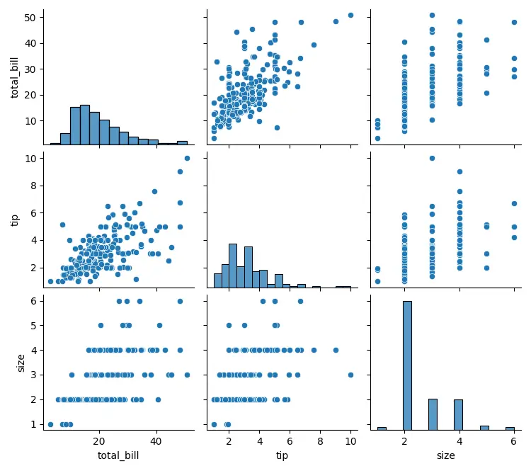
Pair Plot
A pair plot visualizes the relationships between all variables in a dataset, pairwise. It’s a useful tool for quickly exploring datasets.
# Importing required libraries
import seaborn as sns
import matplotlib.pyplot as plt

# Loading a sample dataset
tips = sns.load_dataset("tips")

# Pair plot of the tips dataset
sns.pairplot(tips)

# Display the plot
plt.show()
This will generate a grid of scatter plots for every combination of numeric columns in the dataset.
Output
Violin Plot
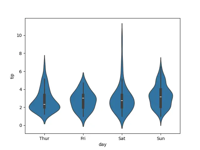
A violin plot shows the distribution of data across different categories. It’s similar to a box plot but provides more information about the distribution.
# Importing required libraries
import seaborn as sns
import matplotlib.pyplot as plt

# Loading a sample dataset
tips = sns.load_dataset("tips")

# Violin plot to visualize the distribution of tips by day
sns.violinplot(x='day', y='tip', data=tips)

# Display the plot
plt.show()
Output
Customizing Seaborn Plots
Although Seaborn takes care of many default settings, you can still customize the appearance of your plots.
Changing Themes
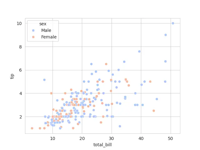
Seaborn provides a few built-in themes that can be applied to your plots. For example, you can change the style to “darkgrid” (which is the default) or other styles like “whitegrid”:
# Importing required libraries
import seaborn as sns
import matplotlib.pyplot as plt

# Loading a sample dataset
tips = sns.load_dataset("tips")

# Set a different style for the plot
sns.set_style("whitegrid")

# Creating a scatter plot with colors based on the 'sex' column
sns.scatterplot(x='total_bill', y='tip', hue='sex', data=tips, palette='coolwarm')

# Display the plot
plt.show()
You can also remove grids entirely.
Output
Differences Between Seaborn and Matplotlib
Seaborn and Matplotlib are two of the most commonly used libraries for data visualization in Python. While Seaborn is built on top of Matplotlib, they serve slightly different purposes. Let’s explore the key differences.
What is Matplotlib?
Matplotlib is a low-level data visualization library that gives you full control over every aspect of your plot. It is versatile and can create a wide range of visualizations, but it often requires more code to make the plots look visually appealing. If you need deep customization or want to create simple plots, Matplotlib is a great choice.
Key Differences
| Aspect | Seaborn | Matplotlib |
|---|---|---|
| Ease of Use | High-level, easier to use | Low-level, more complex to use |
| Visual Appeal | Beautiful visuals by default | Basic visuals, requires customization |
| Statistical Plots | Excellent for statistical plots like heatmaps, pairplots | Requires more effort for statistical plots |
| Data Handling | Works seamlessly with Pandas DataFrames | Works better with NumPy arrays |
| Customization | Limited customization (but can be combined with Matplotlib) | Fully customizable but requires more code |
When to Use Seaborn vs Matplotlib
- Use Seaborn when you need quick, visually appealing statistical plots or when working with Pandas dataframes. It’s great for exploratory data analysis.
- Use Matplotlib when you need full control over the plot or want to create highly customized visualizations.
Conclusion
Seaborn is an excellent tool for creating attractive and informative statistical plots in Python with minimal effort. It builds on top of Matplotlib and simplifies many aspects of data visualization, especially when working with datasets. Whether you are just starting out or already have experience with Python, Seaborn will help you create better visualizations in less time.
In this article, we covered the basics of Seaborn in Python, explored some of its powerful plotting features, and compared it with Matplotlib to help you decide which one to use. Now that you have a good understanding of Seaborn, you can start using it to visualize your own data!


